AI coding agents are good at producing front-end code that looks right. Ask one to build a settings page and you will get a plausible settings page. However, look closer and the cracks show: hard-coded hex values where design tokens should be, and a hand-rolled button that almost matches the one in your component library. Each choice is defensible on its own. None of it belongs to your design system.
The knowledge to do it right already exists. Trinity, BILL’s design system, records the components and tokens, along with the rules for using them, and it serves designers and engineers well. But it was built for humans: people who open a documentation site and read. AI agents need the same knowledge in a shape they can query, in whatever environment they happen to run.
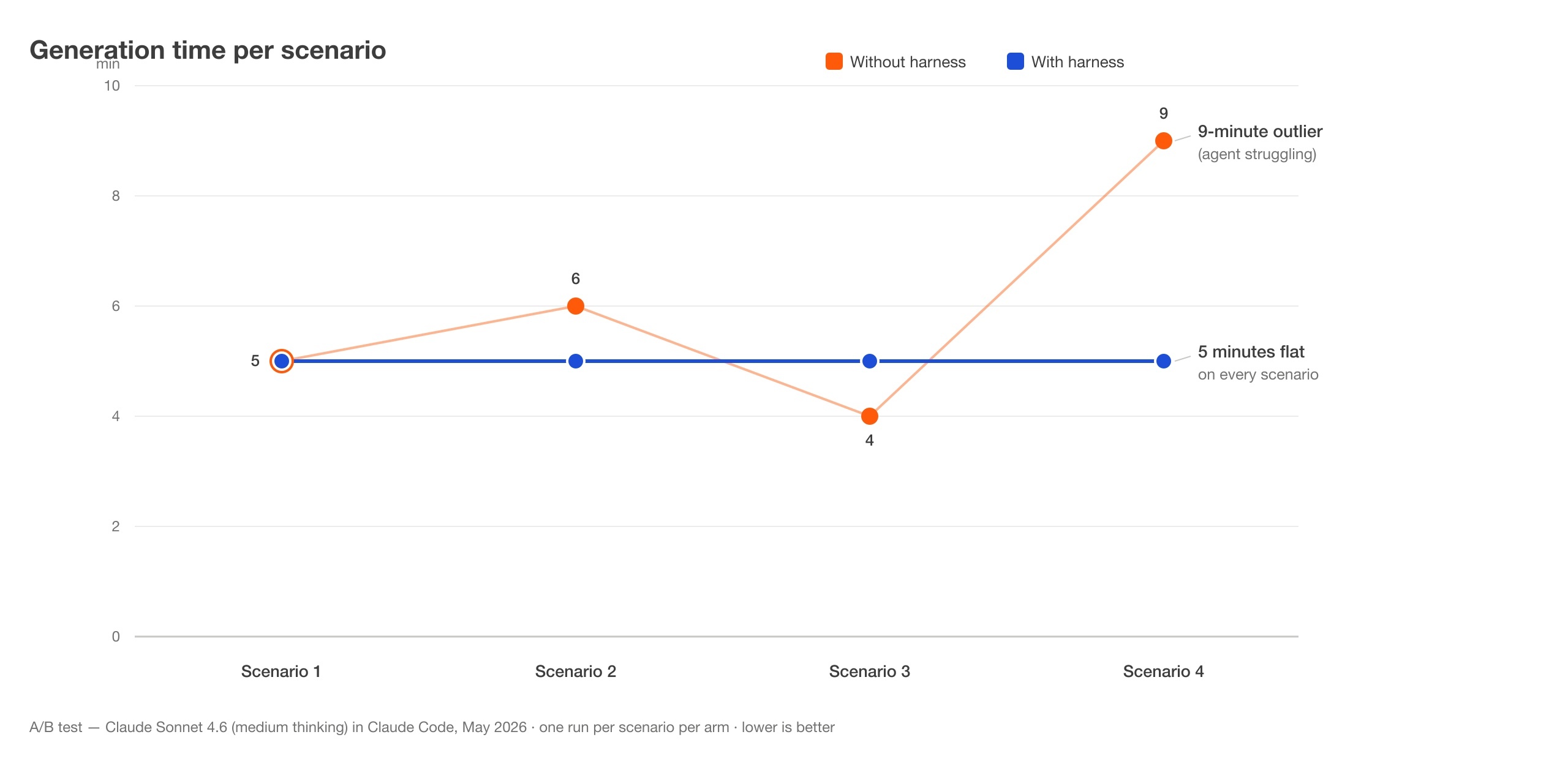
So we turned Storybook into a shared interface for humans and AI agents. Storybook remains the single source of truth. On top of it we built a CLI, a hosted MCP (Model Context Protocol) server, and a set of agent skills that make AI agents first-class consumers of the design system. In our A/B tests, grounding an agent this way cut token usage by 31–63% per task and held generation time steady at five minutes per run. Component fidelity improved as well: the grounded agent produced correct components on the first pass, where the ungrounded agent shipped wrong ones.
This post walks through the full case study: the problem we started with, the architecture, one task traced end to end, the lessons that shaped the design, and the results we measured.
Before building this harness, we spent time observing how an ungrounded AI agent behaves when asked to generate UI code in our monorepo.
The ungrounded agent cannot ask the design system for answers, so it excavates them. It runs cat and grep over the built dist/ output of our component libraries, trying to reverse-engineer component APIs from compiled sources. That exploration is expensive (it can burn millions of tokens on a single task) and brittle, because compiled output was never meant to be read as documentation.
Some gaps cat and grep cannot close. Design docs call one of our components a “radio tile”, but for historical reasons its code name is “in-container-selector”. Nothing in the source connects the two names. In one test run we asked the agent for a “radio tile group”, but it shipped standard “radio buttons” instead. In another run it produced a form UI where no fields were rendered at all.
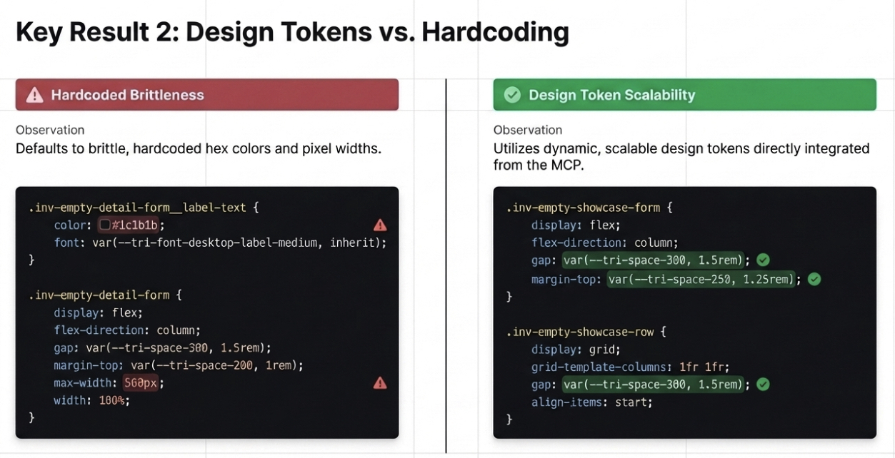
Even when the agent finds the right component, it improvises the styling: raw hex values like #1c1b1b instead of our color tokens, and max-width: 560px where a spacing token belongs. Each violation costs a review comment and a correction round. The output resembles our product without being built from it.
All of these failures share a cause: the agent was working blind. Our documentation site held the answers, and an agent with browsing tools could technically read the pages. But the site was never built with AI agents in mind, and consuming it page by page is slow and unreliable.
Everything the agent needed was already written down. Component APIs, code examples, accessibility guidance, and design tokens all live in Storybook, and keeping them current is an embedded part of our development cycle. What was missing was a structured interface agents could query directly.
Our bet: instead of writing new docs for AI, turn the existing source of truth into a shared interface for humans and agents.
Storybook fits this job because stories are code. A story file imports the real component and renders it, so the documentation compiles against the same source it describes. Rename an input or remove a property, and the affected stories break the build; a component change that skips its docs fails CI before it merges.
Stories also live in the same repository as the components and change in the same merge requests. Documentation that ships with the code has no separate lifecycle to fall behind on.
We considered and rejected three other paths:
The design system would become bilingual by leveraging one body of knowledge with two delivery shapes. Humans get the browsable Storybook site. Agents get the same content as structured data, plus instructions for using it.
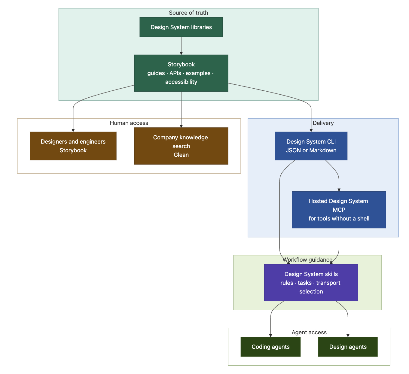
The design system lives in an Nx monorepo where every component is its own project, and every project carries its own tech documents: a get-started guide, API reference, code examples, accessibility recommendations, a migration guide, etc. Building and updating these docs is part of shipping a component change. Agent skills generate and update these tech documents, which keeps the work cheap enough that nobody skips it.
The anti-drift mechanism is the build graph itself. When a component’s docs change, the Nx dependency graph marks the CLI project, which depends on every component’s docs, for rebuild. The CLI gathers the documents and is distributed as an npm package. The MCP server project depends on the CLI project, so it rebuilds too. Components, CLI, and MCP are versioned together and published in one automated CI run. There is no human in the loop to forget a step.
Every generated tech manual carries its own provenance, so an agent (or a human) can see what it was built from:
Tech Manual Version: Generated for @bill/trinity.ng@x.y.z on 2026-03-16
The Design System CLI (@bill/trinity.ng-docs) is the same knowledge rebuilt for machines: a thin layer that curates the Storybook docs and serves them to a terminal as structured output. One flag per invocation, JSON on stdout:
Usage: trinity.ng-docs <flag>

Flags (exactly one per invocation):
  --components       List all component names with their aliases.
  --icons            List all design-system SVG icon names.
  --tokens           List all Pathfinder tokens with values.
  --typography       List @use + @include mixins for typography.
  --font-faces       List the @font-face declarations.
  --component=<name> List absolute paths of a component's docs.
  --icon=<name>      List an icon's data and rendered SVG.

Modifiers:
  --theme=<name>     Theme for --tokens and --font-faces. Valid: bill, aire.
  --include-legacy   Include legacy tokens in --tokens output.
Ask for tokens and you get names and values, with no web page to parse:
[
  { "name": "--tri-color-fill-accent-secondary", "value": "#ff5a0a" },
  { "name": "--tri-color-fill-danger",           "value": "#ffdad4" },
  { "name": "--tri-space-300",                   "value": "1.5rem" },
  ...
]
Component docs work in two steps: --component=data-table returns the paths of that component’s documents (get-started, accessibility, migration), and the agent reads only the ones the task needs. The slicing keeps context small: the agent pulls a few focused documents instead of ingesting an entire library.
Not every tool environment has a shell. Browser-based and hosted tools usually cannot run npx, so we built a hosted MCP server to expose that same curated knowledge directly to agents:
get_component_names - List all component names and aliasesget_component_details - A component’s manual: API plus code examplesget_design_system_tokens - Design tokens (colors, spacing, typography)get_typography_mixins - SCSS text-style mixinsget_font_faces - Global font-face declarationsget_icon_names - Approved SVG icon namesget_icon - Fetch a specific iconget_mcp_version - Server version (also used as a health probe)Because the MCP server is built from the CLI package, the two transports always serve the same answers.
Information alone does not make an agent reliable; our early runs taught us that. The Design System skills are instruction sets that load into the agent and turn the docs into behavior. Three parts do most of the work.
First, a data-source check that runs before any code is written. The skill probes the MCP server (get_mcp_version); if it is unreachable, it falls back to the CLI at a pinned version; if neither responds, it refuses to proceed:
TRINITY DATA SOURCE UNAVAILABLE
Neither Trinity Ng MCP nor the ng-docs CLI responded. Cannot verify components or tokens.
No frontend code will be generated until a data source is confirmed.
That refusal is deliberate: a stalled task is easy to recover from, while plausible ungrounded code that slips into a merge request is the failure this system exists to prevent.
Second, hard styling rules. The no-hardcoded-values rule is written as an anti-pattern list the agent checks itself against:
/* Never */
color: #473cc5;
padding: 16px;

/* Always */
color: var(--tri-color-fill-accent-secondary);
padding: var(--tri-space-300);
Third, an escalation path for gaps. When no design system component matches, the skill requires the agent to stop and report what it needed and what it searched, then get approval before writing custom code. A gap becomes a visible decision instead of a silent hallucination.
The skills also absorb the plumbing: they pick MCP or CLI based on what is available in the user’s environment, and users never have to track which transport is active.
Skills can drive whole workflows too. The /create-design-prototype skill scaffolds a prototype project with Claude Code: a Git repo, build tooling, and a CI pipeline that hosts the prototype on AWS CloudFront for colleagues and customers to review. With this skill, designers can now set up their own prototype projects without waiting on engineering support.
None of this displaced the human-facing side. Designers and engineers still browse Storybook. The same docs also feed Glean, our company knowledge search, so a PM asking a design system question gets an answer from the same source the agents consume. There is no parallel wiki to maintain and no second copy to go stale.
For designers, the grounding layer works across various design tools, and we deliberately do not mandate a single tool.
Figma Make reuses the Design System skills for designers who want to stay in Figma.
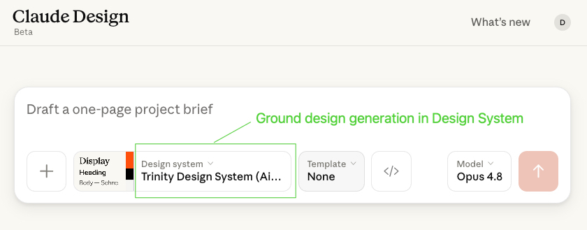
Claude Design takes a looser approach: we generate a design.md brand-guidelines file from CLI output and let it build pseudo-components. That looseness suits one-off explorations that can step outside the current visual language.
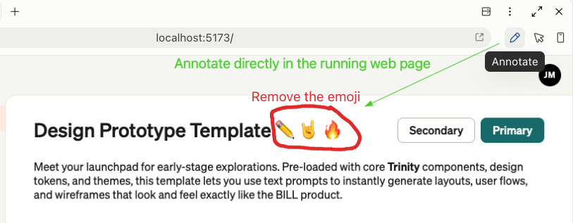
Claude Code (desktop or CLI) is for designers who want full control of the agent and its harness; the desktop app’s built-in browser annotation tool lets designers comment directly on a running prototype and send the feedback straight back to the agent. Iterating on a design this way feels flexible and intuitive.
Prototyping is now fast enough that designers do not have to bet everything on a single direction. They can build several candidates, ship each as a running web app behind a shareable link, and gather user feedback. Engineers then implement the winner with confidence, because it already speaks the design system’s language.
A change to a design system library updates its Storybook docs; the Nx graph rebuilds and republishes the CLI and MCP from those docs; the skills read whatever the transports serve. Update once, and every consumer, human or agent, inherits it in the same release.

To test the effectiveness of our Design System harness, we ran a set of A/B tests: the same front-end tasks given to the same agent twice, once without the Design System harness and once with it. The full numbers are in the evaluation section below. Here is one of those prompts submitted to AI agents:
Create a user profile form at lib/workspace.component.html. This form should have Street (input), State (select), Country (search select), Date of Birth (date picker), Base salary (currency input), Phone number (phone input), Department (radio tile group).
Step 1: the skill loads and picks a transport. The data-source check probes the MCP server. It is up, so the run uses MCP. (If it were down, the CLI fallback would serve the same data at a pinned version.)
Step 2: component discovery. The agent calls get_component_names and maps each requirement in the prompt to a real component: input, select, search-select, date-picker, currency-input, phone-input. For “radio tile group”, the docs resolve the vocabulary problem directly. The manual opens:
Radio tile group (previously In Container Selector) — A radio tile component. Previously known as in-container-selector. Offers users a single selection from two or more options. Unlike radio buttons, tiles can be deselected by default.
That single line is the bridge between the designer’s word and the component’s name, and grepping compiled output has no way to surface it.
Step 3: the manual supplies usage. get_component_details("radio-tile-group") returns the versioned tech manual: properties tables, form-control integration, accessibility notes. The manual includes a reactive-forms example:
<form [formGroup]="addressForm">
  <tri-ng-in-container-selector-group formControlName="state">
    @for (s of states(); track s.value) {
      <tri-ng-in-container-selector
        [title]="s.label"
        [value]="s.value"
      ></tri-ng-in-container-selector>
    }
  </tri-ng-in-container-selector-group>
</form>
Step 4: grounded generation. The agent composes the form from real Design System components, binds the Department field the way the manual’s form-control example shows, and pulls spacing and color from get_design_system_tokens. In our test run, the grounded agent produced the correct radio tiles, with correct alignment and form wiring, on the first pass from that single prompt.
Without the harness, the same task went differently: the agent dug through dist/ output to guess APIs, missed the radio-tile mapping, and shipped standard radio buttons with hardcoded hex and pixel values. The grounded run also cost less, because reading three curated documents is cheaper than parsing a component library’s compiled source. The token usage and generation times are in the evaluation below.
The pipeline in that walkthrough did not arrive fully formed. Three problems we hit along the way shaped the current design.
The stale-docs problem. Early on, an outdated get-started guide for our Data Table component caused agents to generate code against deprecated APIs. The docs said one thing, the library did another, and the agent had no way to tell. This is why doc generation is wired into the Nx build graph and why every manual carries a version header naming the library versions and generation date it was built from. Freshness became a build artifact instead of a discipline.
The transport problem. Our hosted MCP server is under active development and is not reliable around the clock yet. Early on, agents stalled mid-task when the server went down. The fix is the three-layer data-source check in the skill: probe MCP first, fall back to the CLI at a pinned version (the npm registry is more reliable than a young service), and refuse to generate frontend code if neither responds. We chose a hard stop over silent degradation: an agent that cannot verify components should not write component code.
The information-without-instructions problem. Shipping the CLI did not change agent behavior by itself. An agent with docs tooling available still digs into node_modules out of habit. Behavior changed when the skills made the workflow explicit and non-optional: run the data-source check first, consult get_component_names before assuming any API, never read compiled output, and escalate gaps instead of improvising. Agents need the workflow taught along with the information.
The walkthrough shows how grounding changes an agent’s behavior on a single task, but a single task is an anecdote. To judge whether the harness is worth adopting, we needed measurements. That is what the A/B tests provide: with the same tasks and prompts given to the same agent on both sides, any difference in cost or output comes down to the grounding.
Setup. Four tasks, each run in two configurations: A, the agent without the Design System harness (no skills, no MCP, free to explore the repo), and B, the same agent with the harness (skills loaded, MCP and CLI available). The tasks: one design-to-code scenario (implementing a screen from a Figma design, provided as a Figma URL via the Figma MCP), and three single-prompt scenarios, each a multi-field form spanning seven component types like the user-profile task above. Both configurations used Claude Sonnet 4.6 with medium thinking in Claude Code. Token counts are input tokens, summed from the Claude Code session transcripts with a parsing script; times are wall-clock from prompt to final output. One scored run per task per configuration; the limitations below address the small sample.
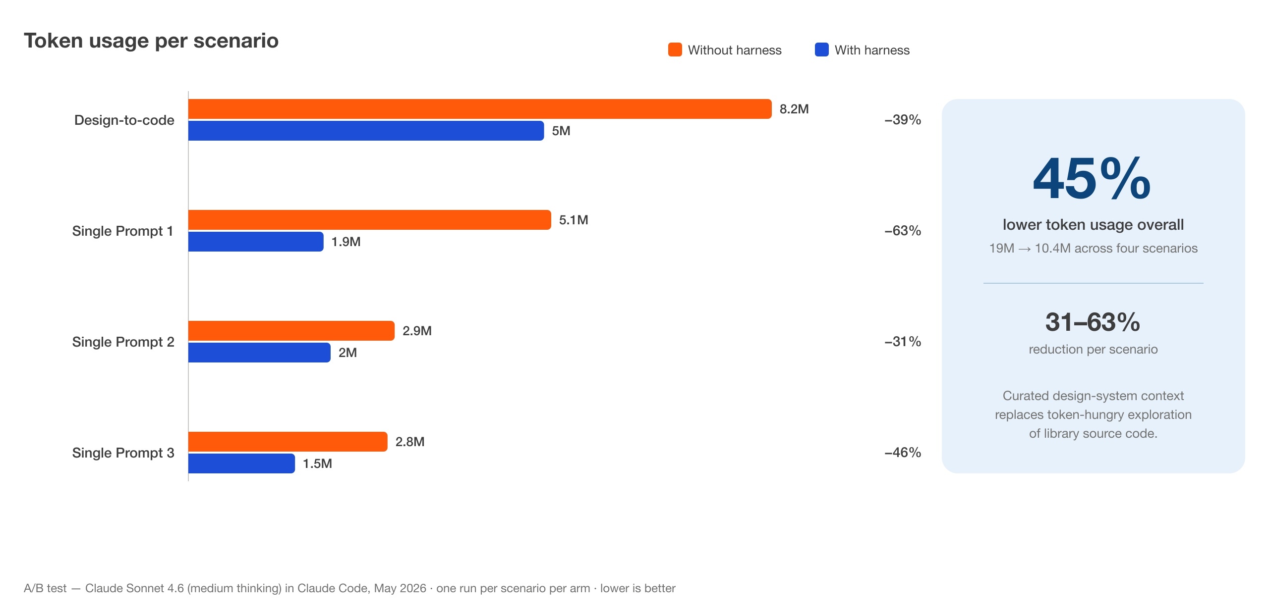
Tokens. The harness cut token usage on every task: 39% on the design-to-code scenario (8.2M to 5M) and 31–63% on the single-prompt scenarios (5.1M to 1.9M, 2.9M to 2M, 2.8M to 1.5M). Across all four tasks, usage fell from 19M to 10.4M, a 45% reduction.
Time. Ungrounded runs took 5, 6, 4, and 9 minutes (median 5.5, range 4–9); the 9-minute outlier came from the agent struggling with source code query and parsing. Grounded runs landed at 5 minutes flat on all four tasks. Predictability eliminates friction, keeping engineering teams in their flow state.
Quality. Token savings alone do not prove better output, so we compared the generated code itself:
#1c1b1b, 560px). With: colors, spacing, and typography follow design tokens.cat and grep exploration of built dist/ output to infer APIs. With: guided context served directly by MCP or CLI.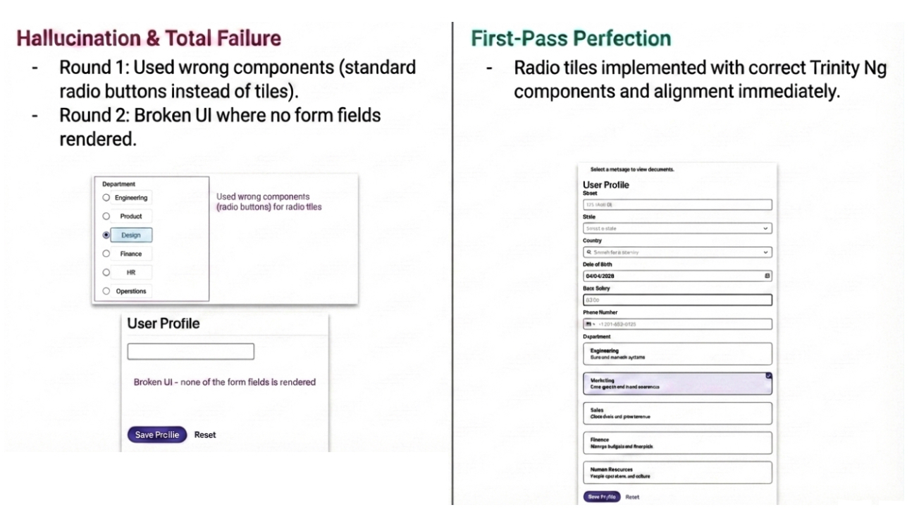
Limitations. This is a small evaluation: four tasks we chose ourselves, one scored run per task per configuration, a single model and harness version, and quality judged by our own engineers rather than blind reviewers or automated scoring. The numbers were strong enough to make the harness our default for front-end agent work, and they match what we see in daily use, but treat them as one team’s measurements. The obvious next step is a larger pass with repeated runs, medians and ranges, and automated checks for token violations, unresolvable imports, and accessibility.
If you already have a design system, you already hold the key information AI agents need. It is just wrapped in a format built exclusively for human reading. We turned Storybook into a shared interface for humans and agents, and the work downstream in design, prototyping, and front-end engineering got faster and more reliable because both audiences now read from the same page.